")
A city dashboard’s primary goal is to give citizens a clear, user-friendly tool to see how well their city is doing. When designing your dashboard, always keep in mind how easy it would be for the average citizen to use. If you include too many factors into your visualization, it will be much harder for users to know what to look for to answer their question. For example, if you wanted to find out how much greenhouse gases a certain San Francisco city sector emitted in the chart below, could you?
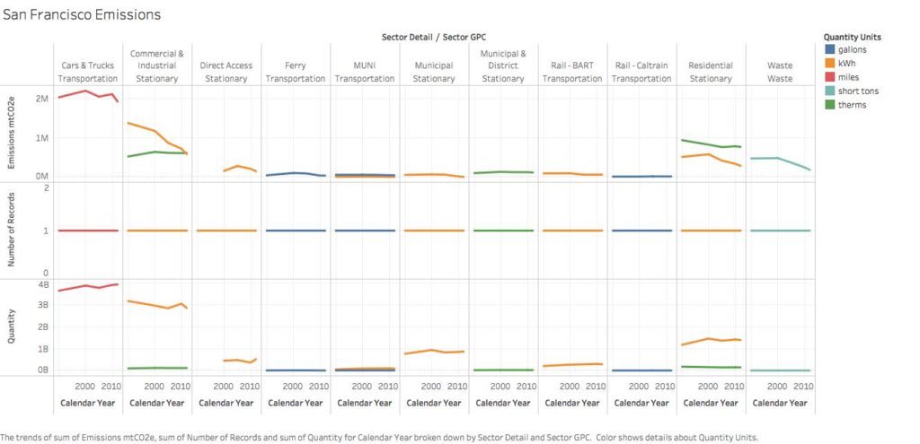
It doesn’t do its slated job of presenting the data to the users in a clear and accessible way. The labels are too small, there are over 30 line graphs, multiple axes, and repetitive time lengths. Many frustrated users just might call this visualization plain nonsense. When building your dashboard visualizations, it’s important to keep in mind to match your design to the overall user experience. Below are some tips for achieving that goal.
1. Keep it simple and straightforward
The fundamental purpose of your dashboard is to tell the story about the trends of a large volume of data. An overly complex chart that tries to do a lot at once will confuse people, and not effectively communicate the data story. A simple visualization of the data is most often best. While designing your chart, always strive to create something for a general audience that won’t be difficult to analyze.
For example, if you’re making a simple line graph showing the homeless population in your city over time, you may be tempted to use multiple lines showing all the different groups of people experiencing homelessness over time.
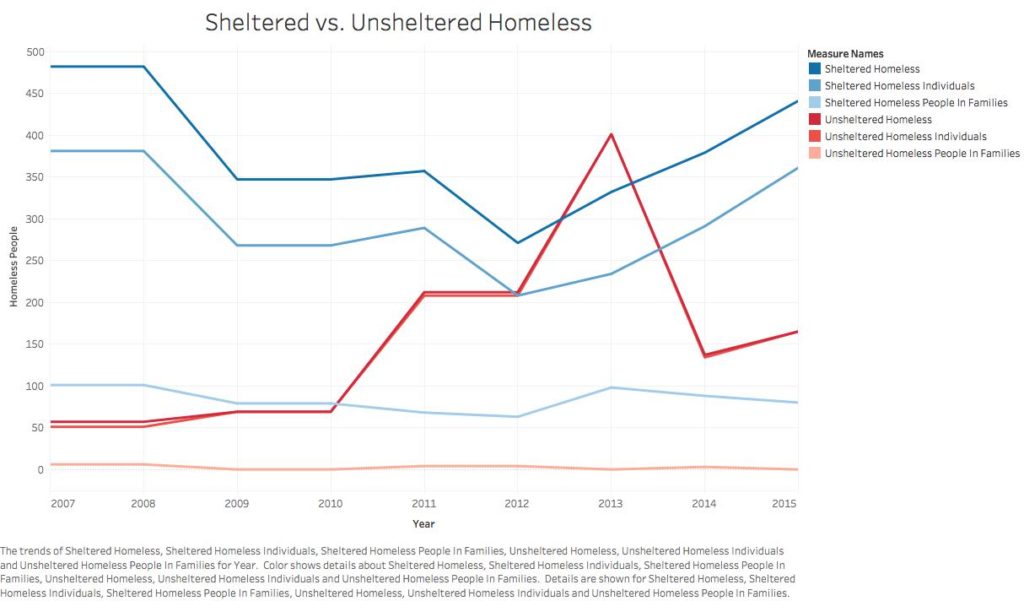
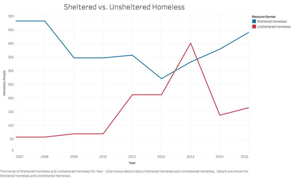
However, such a graphic could be potentially confusing, as viewers may not be looking for all those different groups. Displaying groups more broadly over time, such as the total number of homeless, may be most relevant for citizens to see.
2. Labeling
It may seem basic, but it bears repeating: You need to label and format your labels properly. Accuracy on your labels and legend matters. Even a small mistake in labeling could throw off the user viewing the dashboard. The relative size of your chart to its labels matters. Labels that are too small will be difficult to read; too big and they will distract from the actual content on the graph.
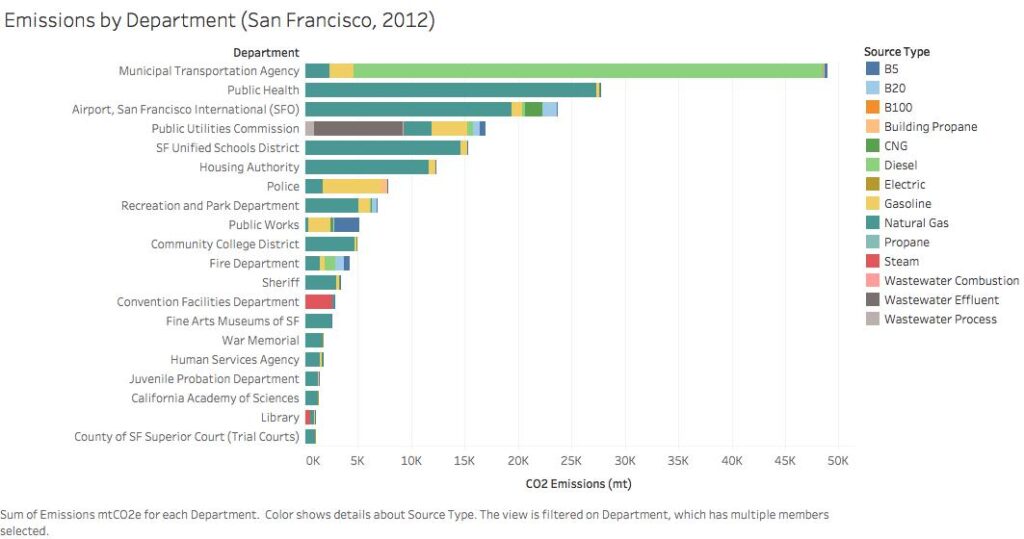
If you have a large amount of data you want to convey, using color labeling can be very useful. For example, this bar graph displaying CO2 emissions by department tells us clearly which department is emitting the most, but doesn’t offer us much information beyond that:
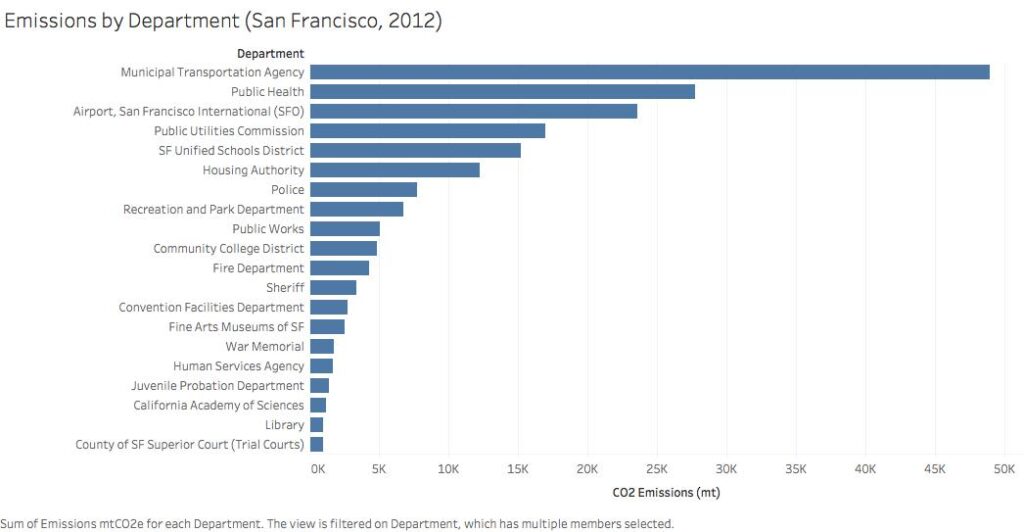
However, if we were to color code each bar with the emissions source type, we’d be able to see a pattern of Natural Gas and Diesel emitting the most CO2.
3. Formatting
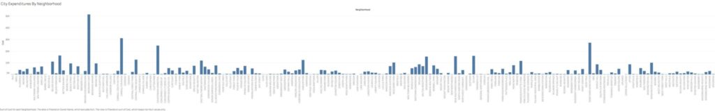
When making your individual graphs, you’ll need to format your x and y axes deliberately and precisely. Simply expecting the program you’re using for dashboarding to clearly format them for your audience can be risky, and you should always check if it reads well and edit the formatting if it doesn’t. You won’t always be able to include all of the information you want, as large data sets with various categories may take up too much space on your screen and detract from communicating the necessary information. Think of it as: “Am I answering the user’s question in an efficient way?” Is it better to compare across 100 categories on a barplot or just 20? If there is a benefit to displaying all categories on your chart, what is it? Simply displaying a lot of information, while impressive, is not necessarily the best tactic for your dashboard to answer the user’s question. This bar graph showing the city’s total expenditures by neighborhood, for example, has dozens of blocks to scroll through, and doesn’t necessarily make for an efficient query:
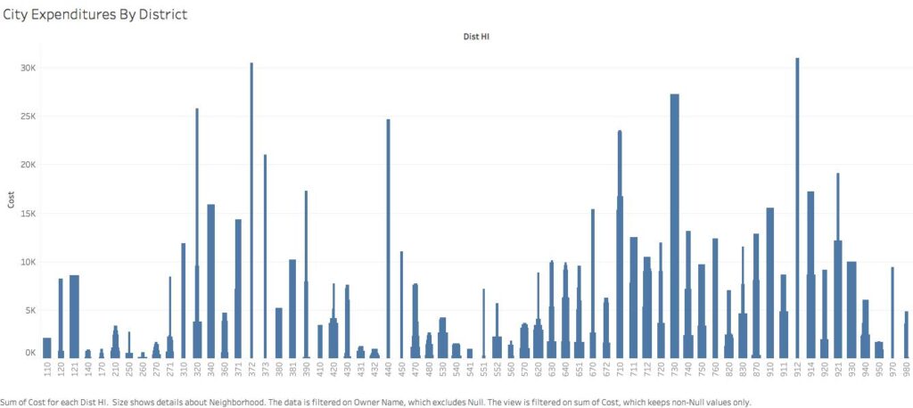
Rather, it is far more useful to limit the length of your axes. If you need to include a lot of information, try to do so in an efficient way. The new graph below achieves this by limiting the x-axis to district numbers instead of neighborhoods letting users find the overall government expenditure in their district. It also includes the neighborhood data by having different parts of the individual district bars sized by the expenditure in each neighborhood. By hovering over each bar below, the graph will show you the expenditure in that individual neighborhood.
4. Get different perspectives
Before publishing, share your dashboard with colleagues that haven’t worked on it. If you have colleagues who doesn’t regularly work with data, that’s even better. Ask them if they find navigation and use easy and straightforward. See if they understand what point you’re trying to convey with your data. The more eyes you have looking at it before publishing the better. Because you’re not designing the dashboard for yourself but for a wider audience, getting a variety of perspectives is crucial. It will only improve the quality of your dashboard.
Have you seen other great examples of dashboards? We’d love to see them! Add to the comments below, or post on Twitter / Instagram with the hashtag #GovExViz